Clear
Clear


A comprehensive task management application that helps users assess their priorities.
June 2023 - August 2023
Concept, Sole UX/UI Designer
Figma, Miro, ProtoPie


solution
A comprehensive task management application that helps users identify their priorities, allowing them to stay focused and make progress on what truly matters.
Alternate between Priority and Date modes depending on the situation to ensure that you focus on the right tasks.


design


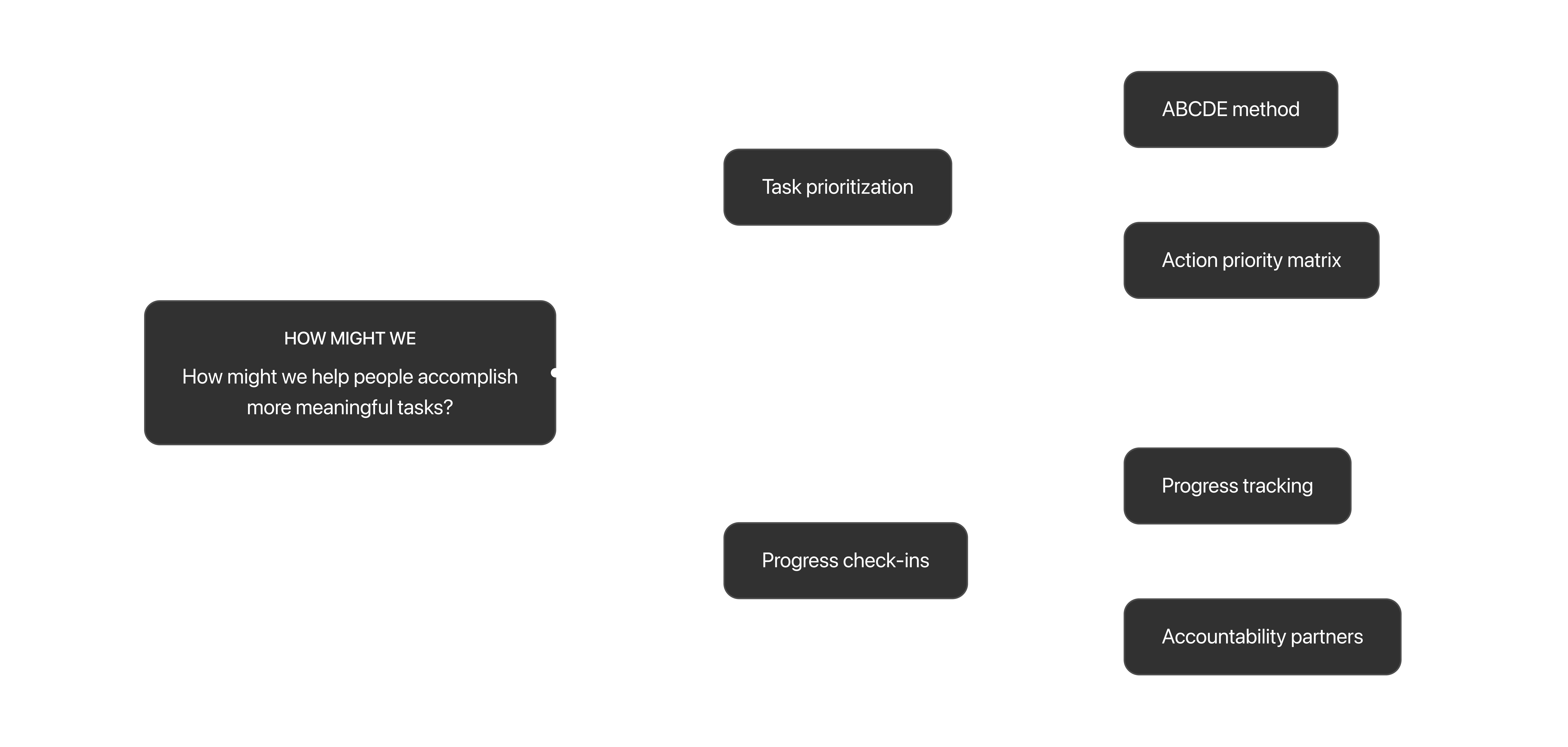
I started designing how the action priority matrix would work within the application.

Initially, the plan was to incorporate the action priority matrix into the application, enabling users to plot directly onto the chart. However, after designing some low-fidelity wireframes and conducting preliminary testing, I found that this approach was ineffective and confusing, primarily due to limited screen space. To improve usability and intuitiveness, I simplified the action priority matrix by extracting its core and developing it into the main feature of the application: the Priority Score.

The design of the task card is the most important aspect of a task management application. Understanding how much information should be available at a glance, and what that information should be was crucial in designing the perfect task card.
I created several different iterations by experimenting with different combinations of elements, style, and hierarchy. During this process, I tried including various features such as sub-tasks and swipe-to-clear. Ultimately, I opted for a simple interface that is intuitive to use and emphasizes the Priority Score feature.
To help users distinguish between urgent and impactful tasks, I implemented two separate input modals that run independently of each other when creating a new task. This allows for the sorting of urgent and impactful tasks to be done separately.


Users wanted to be able to quickly glance at their list and see the task's priority without having to think about a numbering system. To address this issue, I made some visual design changes to the ranking system on the home screen by adding colors and user-friendly language to make it easier to understand at a glance.
The Priority Score is a value that represents the priority of a given task.
When users create a new task, they are prompted with two questions:


These two questions assess the priority of tasks and sort them accordingly. Tasks with high impact that require low effort to complete are placed at the top, while tasks with low impact and high effort are pushed to the bottom. This method of sorting tasks ensures that users focus on meaningful tasks, rather than just those with a deadline.
Final Design
With all this into account, below are the final high-fidelity prototypes of Clear in action:


takeaway
Clear is still a conceptual application, so its real-life impact on helping users prioritize cannot be tested yet. However, the research behind this concept is based on real insights and information. As a result, the projected results are as follows:

Users will optimize their productivity by spending less time deciding what to do and more time accomplishing tasks.

Users will achieve more throughout their day, leading to a sense of satisfaction from working towards meaningful goals.
Thank you for reading!


